20 Creative Signage Ideas to Grab Attention for Your Small Business
A perfect branding and marketing strategy is essential for any new business or expansion. Your brand can have a greater market reach and attract more customers with effective signage ideas
What is Signage?
It’s amazing how it appears when you see the signs. It’s amazing how the product ads register in your brain when you just glance at them for a second. Signage is the ideal tool to create a visual representation. Sign ideas and principles will help you attract more attention and build a customer base.
Here are some key ideas to create innovative business signage
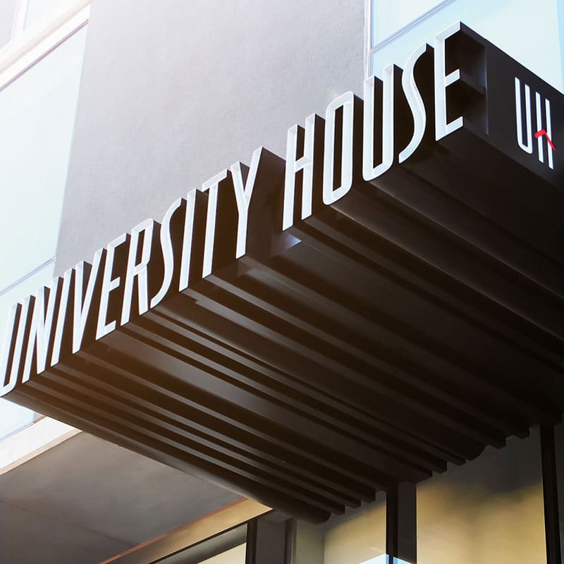
Creative outdoor signage
Idea 1: Signage Visibility
Signs are used to helping customers understand the product’s focus.
A customer will not spend more than 3.5 to 5 seconds reading your signage.
A perfect strategy that grabs attention will help you get more customers to understand your product.
The thumb rule says: Lettering should not exceed one foot in height for every 10 feet of distance.
Signage visibility is enhanced when your business is clearly and easily visible.
Idea 2: Readability of the Business Sign
Make it large and easy to read at any distance.
Signage that is effective in managing white space and adding graphics with strong contrasts is great.
Consider the average speed of traffic when placing outdoor signs.
You should decide how large your content should be. This will allow the traffic to quickly see and absorb the information.
Avoid clutter when designing effective signage. It has a higher impact than Signage.
Idea 3: Is the signage visible?
Why invest in huge amounts when your banner hoardings are hidden under the wiring or bright lights?
Banner ads are used to get great customer responses.
Your banner ads should be visible from the front.
The banner signs should be placed in an easily visible location. Also, ensure that all components of the banner ads are visible and have a place to go.
Signage Design
Idea 4: Scale the Sizes
Designing signage is difficult because it can be hard to choose the right size and scale.
Consider where signs will be placed, such as at the entrance or in the parking lot. This will help you decide the size of the sign you need.
The greater the reach, the larger the size! It makes it easier to read and captures a wider range of customers.
Power Kerning is a powerful tool to scale letters for better visibility.
The human eye can detect every imperfection. It is powerful in detecting over-styling or inefficient spacing.
For a classic design, it is important to have the right size and spacing of letters.
Idea 5: Which Color Attracts Customers?
The magic of color! Beautiful signage can only be created by thinking carefully.
The first to perceive colors is the eye, which plays an important role in defining your Brand’s Identity.
Research shows that around 80% of brand recognition can be attributed to the color scheme. Eventually, this will lead to the Brand’s Trademark.
The best pairing is to use lighter letters with darker backgrounds.
One thing to remember is to keep the letters from being too shady.
Bright and trendy colors will draw more attention.
It is better to have fewer colors — A dominant color with appropriate contrasts and highlights against the lighter shades makes for a winning color combination.
Idea 6: The Best Font to Read from a Distance
Your signage can communicate the same meaning as fonts.
It is crucial to choose the right font style for your Marketing campaign.
Good fonts are easy to read. The eye can see more quickly if the font matches the graphics and colors.
Outdoor fonts should be able to read well even from far away.
Bad fonts with too much detail would blend into the background and give off a messy appearance.
Heavily typed fonts can cause blurred vision and may even lose their basic form.
A common misconception is that all signage should be in capital letters. This would make it more visible.
However, using them can cause eye strain and complicate the visual system.
The most used fonts for designing include Display, Sans Serif, and Helvetica fonts.
Create your quality business sign
Tip 7: Designing signs with a contrast factor
Engaging signs are key to a more successful business.
Signage that is too bright or has graphics can make it difficult to read.
Primitive colors in nature have a strong pull, so it is important to choose colors that are effective and with a high contrast bounce.
Research also shows that blue color is more difficult to read because of the sky, as it matches the color of your sign background.
You can also make a weaker color contrast look more effective by using drop shadows around the foreground letters and outlining them.
Tip 8: Boldness is Beautiful
Branding is Identity. Be bold and colorful with your product.
Your signage will stand out among the rest with a bold and descriptive description.
A perfect balance between larger lettering and contrasts; along with the right weight balance of fonts, will give your signage a bold, projected appearance.
It is important to keep messages and information heads concise and clear.
Tip 9: Signage effectiveness
An Exact Focal Point could increase the effectiveness of signage.
Signage effectiveness is enhanced by focusing on key points and understanding your product.
Signage that is too cluttered with information can make it appear cluttered.
Signage is a visual representation of your brand.
For impressive signage, “Keep It Simple.”
Tip 10 – Emphasize your Identity
There are many competitors in today’s market for the same brand.
Your brand and signage must reflect who you are in the market.
What are your competitors doing? Do some research to see what their standards are. This will help you tweak your product and not repeat the mistakes of your competitors.
Make your brand stand out from the rest to make your brand more memorable.
Tip 11: Use catchy words to grab customers
When choosing words, be wise and careful.
A greater reach would be achieved if you use precise and precise words that convey the exact meaning of your product.
For attractive signs, use the Industry signage formula: Use a proper Headline, explanatory text, and a catchy Call to Action (CTA) to create a compelling sign.
Information overload is a waste of time! The goal of reaching customers fails.
Signage Design Inspiration
Idea 12: Keep the signage updated from time to time
If you keep the same signage up for a longer time, it will lose its appeal. This eventually causes people to stop paying attention.
It would be tedious to recreate the signage after a certain time.
Certain modifications can be made to existing signs to keep them fresh and vibrant.
The latest technology would make advancements quite impressive.
You can change the look of the Signage by changing the layout, the color scheme, or adding new images to your stock photos. This will give you a fresh new look!
Idea 13: “CLUTTER” Free!
Effective signage requires very little content to accurately convey your business’ meaning.
Intuit suggests that a business sign should contain no more than seven words.
Customers will have difficulty understanding the sign if they see more than the minimum count.
Understanding is greater when there are fewer words. Focus on the essential information.
Create the Signage with plenty of white space. This is the area left unoccupied by graphics or text.
It is a common tendency to project creative signage with bold graphics and beautiful text. However, too much information can increase clutter and reduce natural readability.
For optimal readability, studies suggest that at least 30% to 40% of the area should be left empty.
Idea 14: The Perfect Signage Location
When placing signage, you must consider the location.
Before placing signage, it is important to verify the Zoning and Lease requirements.
These are some factors that will help you decide how to place your signage boards.
Point of Transit
Signage placement at these locations requires greater diligence. The content should be precise and to the point.
This area is mostly populated by people who are always in a hurry.
The signage design should be clear, simple, and effective.
Point of Sale
It is important to emphasize the importance of selling.
Use catchy words that are memorable and will attract large audiences. This will promote your business extensively.
Make sure that the information displayed on the screen is legible within the time limit.
Point of Wait
The goal is to distract the captive audience.
Here, a more detailed description of your brands and products would be more effective.
Because it is supposed to grab the attention of the audience and distract them away from the monotonous queues, creative design should have a greater emphasis on graphics and text.
Idea 15: Signage Materials
A great base is essential for creating beautiful signage. It is difficult to paint or print on uneven and rough bases. You can deliver better signage by choosing the right material. These are the materials that can be used to print or paint signage
1. Carved Wood:
It is primarily constructed with plywood components, and it lasts longer.
It also provides a smooth and firm base for painting.
MDO cannot be easily withered under the most severe weather conditions.
This base material is used in a variety of applications, including sign panels, site signs, billboards, highway and traffic signs, as well as billboards.
2. Aluminum
Aluminum is simple to use because it comes in a wide variety of sizes and colors.
Because it isn’t rusty and it can be engraved over very clearly, it is considered one of the most durable outdoor materials. Use this material as a design material for — No Parking Signs, Real Estate Signs
3. Aluminate
Aluminate is the most popular signage material. It is thick and strong, and it is not easily corroded.
It comes with a guarantee that it won’t crack, chip, peel, or flake.
It can be used to base any type of sign.
Useful for applications such as — Wall/fence mounts, billboards, and cut-outs.
4. Acrylic
Acrylic is made from Methyl Methacrylate monomers. It has remarkable tensile strength.
Plexiglas or acrylic has a glossy finish that gives your signage a classic and sophisticated look.
It is flexible and can withstand significant amounts of physical strains. However, it is easy to customize these signs.
Maintenance is simple and does not require too much strain.
Acrylic signs are more popular indoors than outdoors.
This sign material is widely used in Retail shops, Trade shows, and Office Interiors.
5. Banner
Banners are usually made from Nylon reinforced vinyl material.
Banner graphics are only printed on one side.
For a firm with a greater reach, larger fonts and sizes are used.
Vinyl banners are used in a variety of ways, including retail advertising, brand exhibitions, sales and promotions, and trade shows.
6. Coroplast and Corrugated Plastic
Coroplast, made from corrugated plastic, is lightweight and cost-effective as a signage material.
Coroplast Stronger Plastic Sheet is made by bridging two layers. One layer forms a wavy pattern, while the other is flat.
It is easy to customize; longer life span when used indoors and can be used temporarily outdoors.
Mainly used to display logos, directional signage, special events, and trade shows
7. Dibond
Dibond is made of Aluminum on the outside, and solid Polyethylene inside. This makes it lightweight.
Dibond is weather-resistant and easily customizable.
This signage material is professional looking and can be used indoors and outdoors for limited purposes.
These signs are usually mounted on poles and walls.
8. PVC
Expanded PVC allows you to project professional quality signage.
It is extremely durable and medium-weight.
The best material to use for signage. It can also be cut into any shape you prefer.
The matte finish of the product reduces glare and conceals fingerprints.
Use bright colors and simple fonts to give your projects the best signage look.
It is not recommended for outdoor use.
Most commonly used for: Billboards, Business Logos, Nameplates, and Tags
9. Foam Board and Foam Core
This product is great for indoor applications that require short-term maintenance.
Signage material is lightweight and rigid; easily customizable and transportable.
Foam Board’s smooth surface is easy to laminate.
This would be the best choice for mounting digital images or color graphics.
Foam Board is used for Welcome signs, Directional Signage, and Conferences or Trade Shows.
10. Metal
Signage can be made from metals.
Metal signs materials can withstand almost any wear and tear.
They are strong and can be easily cleaned.
You should take extra care to keep the signage clean.
This is used primarily for directional information and service signs.
11. Neon
Neon signs can brighten up your product’s spirits.
Neon signs can be used as a marketing tool 24/7.
It can be used indoors and outdoors, but its effectiveness is enhanced at night.
It is a great eye-catcher that quickly grabs the attention of users.
Useful for: Restaurants, Cafes, and Movie Tapings.
12. Plastic
These signs can be used indoors and outdoors for short-term signage ideas.
It is a powerful tool for advertising, and both sides can be used in this process.
Oils or other solvents won’t affect the surface. It can be easily cleaned.
These signs are lightweight and easy to move.
Primary applications include Promotional Signage and Conferences, Menu Boards, and Informational Signage.
13. Styrene
When compared to corrugated materials, this plastic has higher durability.
It is strong and rigid and free of dents.
Because of its flexibility, Styrene can be made into any shape you like.
Servers last longer indoors, and yellow deposits are formed after prolonged outdoor exposure.
Most commonly used in Interior Store signage, Special events.
14. Vinyl
This product is preferred for both temporary outdoor and permanent indoor use.
Available in vibrant, vivid colors
It is easy to read and see from further distances.
It’s very durable and can last longer when used indoors.
Exposure to the elements for too long could cause severe damage.
Primary applications include Photos and Logos display, New Ownership sales, and Communication Messages.
15. Magnet Signs Printed
This is a unique marketing method that can be used on steel surfaces that look like vehicles.
These signs are easy to install and remove.
You could turn your vehicle into a temporary billboard.
It is possible to customize the product and have it cut to your exact dimensions.
It is more easily understood when it uses vivid colors and clear text.
Signage uses: For Company cars, delivery trucks, and vans.
Idea 16: Signage costs
The cost of signage varies depending on factors such as size, color and text content.
The sign’s cost can vary from $8 to several thousand dollars depending on the material and size.
You can decide on the costs depending on how much reach the product will have.
When you already have a budget in place, choosing the right materials and sizes is not a problem.
Signage advertising statistics
Idea 17: The Impact Factor
You want to make a memorable sign that has a great impact on the public.
A high Impact factor is essential for a business to reach its full potential.
The Line Height and the Readable Distance are two factors that impact the Impact Factor.
Idea 18: Images & Graphics
Research shows that adding borders to images improves readability by 26%.
To make signage stand out, add graphics and images.
According to research from the Pennsylvania College of Optometry, a color added to the mono-colored graphic design can increase the User’s retention by around 78%.
A full-color graphic design will make your message stand out.
A digitized photo can be added to increase the recall by 300%.
Signage can be enhanced visually by adding artwork, a Business Logo or other graphic elements.
Idea 19: Background and foreground colors
Color plays an important part in devising impressive signage.
Most importantly the color contrasts project the signage out in the public.
So choosing the Background and Foreground colors play a leading role in a greater signage reach.
Idea 20: Precise Angle
It is always true that signage gets noticed more when it is placed at the right angle.
It is important to determine the angle at which signage should be placed when it is outdoors.
Place the signage so that it faces the traffic flow at an angle of 45 to 90 degrees.
Noticing signs that are parallel to traffic flow is not a good idea.
You want your Business Brands to be viewed by them exactly the way you want.
Related Article: International Design Awards 2016 Call for Entries
Conclusion:
Entrepreneurs everywhere would want to have a greater reach for their businesses. The focus would be on promotion that improves branding and identity.
In case you are turning a void on components for enhancing your Business, these signage ideas could come in handy, or if you are planning to start up a business, implementing these ideologies can probe your business to reach higher.